Wednesday, April 25, 2012
Homework 3: Neogeography
View Donner Party Route in a larger map
One example of neogeography at work is shown above. I created my own map using a pre-existing toolkit, Google Maps, to share location information and convey knowledge about the world. In this particular map, I drew the route taken by the Donner Party when they traveled the perilous road to Sutter's Fort, CA. To help illustrate their path, I embedded a video of present-day Donner Pass and an 1847 photo of Sutter's Fort.
Neogeography has multiple purposes; it can enhance people's understanding of the past, illustrate important and relevant data, or provide details into someone's personal life. No matter what the goal, the interactive and accessible nature of neogeography allows both the map creator and the map viewer to explore the world without leaving their home. Neogeography provides a user-friendly means for non-experts to share information about their experiences or interests with friends and other visitors, subsequently playing a huge role in increasing geographical awareness.
However, neogeography has its pitfalls as well. Although it makes geography highly accessible, this accessibility can give rise to inaccuracy. With the advent of Web 2.0, absolutely anyone can make a map about anything, even those without the proper background and education to do so. This increases the risk of biased or inaccurate data, and assuming the map is public, this misinformation would be available to thousands of online users.
For example, the information in my own mashup is somewhat misleading. Although I did my research to ensure that my map of the Donner Party route was as accurate as possible, I could not escape the fact that I had no way of knowing the exact route. I used Google Maps' "Draw a line along roads" feature because I didn't want to connect the points with a straight line, but back in 1846, those roads didn't exist, thereby rendering my map inaccurate. Likewise, I had no way of knowing the exact location in the cities that the Donner Party passed through. Although neogeography has made it possible for me to visualize my understanding of the Donner Party's journey, my mashup would not be the best choice for anyone who is looking to find the most historically accurate map.
Friday, April 20, 2012
Homework 2: Reading USGS Topographic Maps
2) The names of the adjacent quadrangles are: Canoga Park, Van Nuys, Burbank, Topanga, Hollywood, Venice, and Inglewood.
3) The quadrangle was first created in 1966.
4) The horizontal data used to create this map are the North American Datum of 1927 and the North American Datum of 1983. The vertical datum used to create this map is National Geodetic Vertical Datum of 1929.
5) The scale of the map is 1:24,000.
6a) 1200 m
6b) 1.89 mi
6c) 2.64 in
6d) 12.5 cm
7) The contour interval for the map is 20 ft. The supplementary contour interval is 10 ft.
8a) Public Affairs Building:
degrees/minutes/seconds:
34° 4' 30" N, 118° 26' 30" W
decimal degrees:
34.075° N, 118.442° W
8b) the tip of the Santa Monica Pier:
degrees/minutes/seconds:
34° 0' 30'' N, 118° 30' 00" W
decimal degrees:
34.008° N, 118.5° W
8c) the Upper Franklin Canyon Reservoir:
degrees/minutes/seconds:
34° 7' 20" N, 118° 24' 30" W
decimal degrees:
34.122° N, 118.408° W
9a) Greystone Mansion elevation:
560 ft or 170.688 m
9b) Woodlawn Cemetary
140 ft or 42.672 m
9c) Crestwood Hills Park
740 ft or 225.552 m
10) The UTM zone of the map is zone 11.
11) The UTM coordinates for the lower left corner of map are 3,763,000 m northing and 361,500 m easting.
12) 1,000,000 square meters (1 square kilometer) are contained within each cell (square) of the UTM gridlines.
13) See below:
14) The magnetic declination is 14° E.
15) The water in the intermittent stream between the 405 freeway and Stone Canyon Reservoir flows from North to South.
16) Screenshot of UCLA:
Saturday, April 7, 2012
Homework 1: Maps
1) Prevalent Languages Other than English and Spanish in the United States
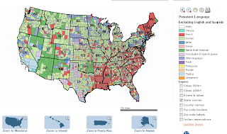
This language map from the Modern Language Association depicts the linguistic and cultural diversity in the United States. The data for this graphic came from responses to the question, "Does this person speak a language other than English at home?", as collected by the U.S. Census Bureau in 2000. From this map, we can see that in the Eastern United States, French is the most prevalent language (aside from English and Spanish). We can also see that Native North American speakers tend to reside in the Western United States. In looking at this map, I did not expect to learn that German is fairly widespread, especially since I have never met an American citizen who is bilingual in English and German. However, I have encountered many Vietnamese-speaking communities, particularly in Southern California, and I was surprised to find out that Vietnamese is not more prevalent. Tagalog seems to be the dominant language in Southern California (aside from English and Spanish), which is quite surprising to me.
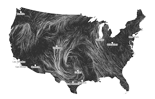
Click on the source link to view the actual animation, which illustrates the direction and strength of wind flow in the United States on March 21, 2011. The surface wind data for this visualization is from National Digital Forecast Database. According to the map, it was very calm in Southern California on March 21, but winds in the Northwest and Southeast were moving very rapidly toward the middle of the country, reaching peak speeds in Northern Texas. When I looked up weather-related articles published on March 21, I learned that there was a tornado in Texas on that date, which explains why the strong winds in that area seem to form a spiral. I find this wind map really interesting because it's a very creative and elegant way of representing data.
3) L.A. County Homicide Victims
This graphic maps out the 613 Los Angeles County homicides in 2011. The size of the red circles represents the number of homicides in that area. If you click on the source link, you can even interact with the map by zooming in or hovering over the circles to find the exact number of homicides that occurred in that location. The above screenshot shows that most of last year's homicides were concentrated in the Compton (127) and Inglewood/Huntington Park (140) areas. Although the Compton numbers don't surprise me, I did not expect Inglewood/Huntington Park to have a high crime rate of any kind. What I find most interesting about the map was the difference between the UCLA and USC areas. When I zoomed in on UCLA, I found that the nearest and only homicide occurred about 3 miles from campus. However, when I zoomed in on USC, I saw that the surrounding area was littered with red circles, with the closest homicide about 1 mile away from campus. This makes me feel grateful to be attending school in a relatively safer area.
 |
| (source: Modern Language Association, 2000) |
This language map from the Modern Language Association depicts the linguistic and cultural diversity in the United States. The data for this graphic came from responses to the question, "Does this person speak a language other than English at home?", as collected by the U.S. Census Bureau in 2000. From this map, we can see that in the Eastern United States, French is the most prevalent language (aside from English and Spanish). We can also see that Native North American speakers tend to reside in the Western United States. In looking at this map, I did not expect to learn that German is fairly widespread, especially since I have never met an American citizen who is bilingual in English and German. However, I have encountered many Vietnamese-speaking communities, particularly in Southern California, and I was surprised to find out that Vietnamese is not more prevalent. Tagalog seems to be the dominant language in Southern California (aside from English and Spanish), which is quite surprising to me.
2) Tracery of Wind Flowing Over the United States
 |
| (source: Hint.fm, March 21, 2011) |
Click on the source link to view the actual animation, which illustrates the direction and strength of wind flow in the United States on March 21, 2011. The surface wind data for this visualization is from National Digital Forecast Database. According to the map, it was very calm in Southern California on March 21, but winds in the Northwest and Southeast were moving very rapidly toward the middle of the country, reaching peak speeds in Northern Texas. When I looked up weather-related articles published on March 21, I learned that there was a tornado in Texas on that date, which explains why the strong winds in that area seem to form a spiral. I find this wind map really interesting because it's a very creative and elegant way of representing data.
3) L.A. County Homicide Victims
 |
| (source: Los Angeles Times, 2011) |
This graphic maps out the 613 Los Angeles County homicides in 2011. The size of the red circles represents the number of homicides in that area. If you click on the source link, you can even interact with the map by zooming in or hovering over the circles to find the exact number of homicides that occurred in that location. The above screenshot shows that most of last year's homicides were concentrated in the Compton (127) and Inglewood/Huntington Park (140) areas. Although the Compton numbers don't surprise me, I did not expect Inglewood/Huntington Park to have a high crime rate of any kind. What I find most interesting about the map was the difference between the UCLA and USC areas. When I zoomed in on UCLA, I found that the nearest and only homicide occurred about 3 miles from campus. However, when I zoomed in on USC, I saw that the surrounding area was littered with red circles, with the closest homicide about 1 mile away from campus. This makes me feel grateful to be attending school in a relatively safer area.
Subscribe to:
Comments (Atom)

