 |
| (source: Modern Language Association, 2000) |
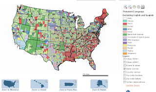
This language map from the Modern Language Association depicts the linguistic and cultural diversity in the United States. The data for this graphic came from responses to the question, "Does this person speak a language other than English at home?", as collected by the U.S. Census Bureau in 2000. From this map, we can see that in the Eastern United States, French is the most prevalent language (aside from English and Spanish). We can also see that Native North American speakers tend to reside in the Western United States. In looking at this map, I did not expect to learn that German is fairly widespread, especially since I have never met an American citizen who is bilingual in English and German. However, I have encountered many Vietnamese-speaking communities, particularly in Southern California, and I was surprised to find out that Vietnamese is not more prevalent. Tagalog seems to be the dominant language in Southern California (aside from English and Spanish), which is quite surprising to me.
2) Tracery of Wind Flowing Over the United States
 |
| (source: Hint.fm, March 21, 2011) |
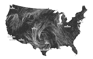
Click on the source link to view the actual animation, which illustrates the direction and strength of wind flow in the United States on March 21, 2011. The surface wind data for this visualization is from National Digital Forecast Database. According to the map, it was very calm in Southern California on March 21, but winds in the Northwest and Southeast were moving very rapidly toward the middle of the country, reaching peak speeds in Northern Texas. When I looked up weather-related articles published on March 21, I learned that there was a tornado in Texas on that date, which explains why the strong winds in that area seem to form a spiral. I find this wind map really interesting because it's a very creative and elegant way of representing data.
3) L.A. County Homicide Victims
 |
| (source: Los Angeles Times, 2011) |
This graphic maps out the 613 Los Angeles County homicides in 2011. The size of the red circles represents the number of homicides in that area. If you click on the source link, you can even interact with the map by zooming in or hovering over the circles to find the exact number of homicides that occurred in that location. The above screenshot shows that most of last year's homicides were concentrated in the Compton (127) and Inglewood/Huntington Park (140) areas. Although the Compton numbers don't surprise me, I did not expect Inglewood/Huntington Park to have a high crime rate of any kind. What I find most interesting about the map was the difference between the UCLA and USC areas. When I zoomed in on UCLA, I found that the nearest and only homicide occurred about 3 miles from campus. However, when I zoomed in on USC, I saw that the surrounding area was littered with red circles, with the closest homicide about 1 mile away from campus. This makes me feel grateful to be attending school in a relatively safer area.
No comments:
Post a Comment